Wednesday, June 29, 2011

Top 10 Mobile Internet Trends - A Must See Presentation!

.: I'm speechless and clueless. Does the number fooled me or I've been blown away by such an enormous opportunity??? See it for yourself.


My review about the future of mobile internet trends?
  • Anything touchscreen will brings money - iPad-like tablet and smartphones is a new fast cash machine. Smartphones is definitely the next big thing - "tiny supercomputer is in our hands".
  • There is no need to worry about language barrier, start with our local mobile scene because the pioneer can be the all time winner.
  • That SoLoMo recipe is great for localized apps or websites. Now where can I find free how-tos on making a free great app but please-pay-for-more-premium-feature?
  • iPhone and Android app store is great way to test the marketability of 3rd party apps. But BlackBerry and Windows Mobile apps can be a niche market.
  • Integrating Facebook and Twitter is a must - need to learn how to integrate their APIs...
  • QR codes + NFC + secure mobile e-cart/payment processor = perfect m-commerce (mobile commerce) recipe?
  • Gamification -> new worldwide currency? Lol, next time there will be a market for m-forex (forex for in-game currency)?
  • As a reminder, starting from the 52nd slide contains tips, ideas and cheats of future mobile trends~ ;-)
Via Tools | WatchThisSpace.


aiemm: "Ads in videos is a nuisance. But from such ads I found this useful tool. Next time, I will try to watch that space very, very closely, lol~"
:-P
:.

the Google+ Project : +1 button gets a new home~

.: First, they created the "Like" button. After some careful and thorough observations, now they create the "home" for the previous "Like" button. Smart, aren't they? :-P

The plus everything project.
Google now has it's own secondary social networks. Still in the beta phase, the new social network called the Google+ is designed to overthrown Facebook dominance ASAP make everyone's life more happier and merrier by connecting each and everyone together. By using a similar-to-groups-concept they name it 'Circles', our updates between our connected friends and relatives and work colleagues and the boss won't mix and that's definitely a plus feature from Google+.

The Google+ project: Explore Settings

Sorry, I get carried away just now. At the moment Google has shown 4 available features of their new social network - Circles, Huddle, Sparks and Hangouts, which nothing new for those who has already use Facebook before. It looks pretty simple and easy to use with their familiar GUI, but currently Google+ only invites some lucky participants to test them out. We can only hope someone will invite us or wait for it to becomes public.

Here is their 4 available features we can peek together~

The Google+ project: Explore Circles
Google+ "groups"~

The Google+ project: Huddle
Google+ "Tweets"~

The Google+ project: Explore Sparks
"Related Searches" + "Google Instant" = Google+

The Google+ project: Explore Hangouts
mIRC + Video chat = Google+

See, nothing new right? It's just a re-branding of all internet products out there that we all familiar with. It may be a good thing because everything is put and mixed together in one place so there is no need to download different software for different use or visits different websites for different service, but I still don't like the users data mining activity which I read somewhere on the Net before. (Facebook do "collect" our data, it's the same thing in any social networks).

It's up to you whether to use it or not, but I do wanna give it a try. You can read and discover more at plus.google.com.


i) lol~ (Maybe he *will* create the official Dislike button because of this?)

ii) Bye bye Orkut or integrate/migrate Orkut inside Google+?


aiemm: "Making everything social is the new war~~"
:.

Sunday, June 12, 2011

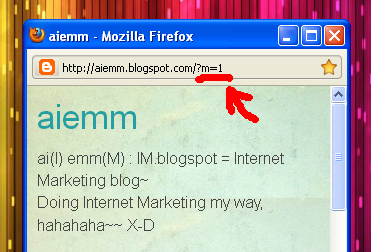
?m=1 : Shortcut for Blogger blogspot mobile version~

.: I got it all wrong, haha :-D

Previously, I on my quest finding the online version of mobile browser on the internet, but didn't get the correct output. Mobile version of this aiemm blog should appear very simple minimalist and easy to read, like the one you see in this 'Turning on mobile template in Blogger' post. And I thought that when we surf using our mobile browser, any Blogger blogspot should be redirected to the mobile version automatically. But when I try with Opera Mini 6 Mobile, it didn't work the way it suppose to.

This brings out a big bright yellow question mark on my head, what is the problem?
  • I should use mobile browser in my own mobile phone, instead of using online simulators from the internet, or
  • current Blogger template were not made to automatically redirected to the mobile template version yet.. (incomplete HTML formatting?) Or
  • I've used the wrong URL...
Haha, I think I made the last mistake here X-D I didn't notice the URL difference in both online and mobile version of Blogger, so that's why I can't view aiemm the way I want it to be. In order to view the mobile version of Blogger blogspot, what we must do is to open the right blog address (URL)!

Which one and how to get it?

Based on how to turn on mobile template for Blogger post, we need to add ?m=1 at the end of our blog address to view the mobile version of aiemm.

Look closely, and copy that URL parameter and paste it after
typing our full blog address~

Yeahhhh~ Now Aiemm can rocks on both world! X-D

And now I'm done. My quest is complete, and I'm happy :-) :-) :-)

Before I forget, the addition of ?m=1 works with all Blogger blogspot, unless you've already disable the mobile template then this shortcut won't work anymore. Right now I just can't wait for my Simple template in my aiemm to works like in the new Blogger mobile templates~ :-D

I hope I can get my own Apple iPhone so I can experience myself surfing the Net mobile-ly. Need to work more with this affiliates stuff ;-)


aiemm: "Mobile is the new Net - but how about the radiation and cancer?"
:-(
:.

Online Mobile Browser Simulator : Preview your mobile website online~~

.: How to view the mobile version of your Blogger blogspot or your website online? :-?

At this moment, there is no stable and practical online site that can render or browse all internet website like a true mobile phone browser? What I can found is mobile browser emulator, or mobile browser simulator which kinda imitates and behaves like a mobile phone controls with mobile-sized screen.

I know that Blogger blogspot has it's own mobile template, so after activating that template settings I thought it will be a redirect from original internet template into the mobile template automatically. My phone is not configured yet for online browsing (because I prefer texting and calls more), so I like to test this aiemm blogspot and see how the mobile version looks like online. That's why this post come up, I successfully found one simulator that really "works", hee~ ;-)

Before that, I do hope you already installed Java Platform on your computer before you can use this online mobile browser simulator.

dotMobi N70 mobile simulator.
You can choose to use Sony K750 too~

Emulator | dotMobi : The first site I found is the first fail I encounter. Haha, you got me there. It's ok, I will try again~

Test browsing the internet with
your online iPhone~
TestiPhone : Nice Apple iPhone graphic there, but aiemm is not in mobile version. Maybe I got into the wrong website? Because it claims that it is for testing our iPhone web applications. (This website is very similar with this iPhone 3G/4G tester here...)

Simple minimalist TagTag mobile emulator~
TagTag | Mobile site emulator : Embed TagTag Emulator on my blog? Eh?? Nope, TagTag didn't work like what I was hoping before. Did I do something wrong here? Aiemm URL is correct, so what is the problem?

Opera Mini 6 - built for smartphones
with large screen.
Opera Mini simulator : This one is the "working" mobile browser simulator I mentioned before. It was funny looking at those lines which represents the text on my blog, but if you click on it, it will automatically enlarge the "lines" into an actual text. It's good to see it like this, but this type of mobile browser is best for touchscreen smartphones. If Opera Mini can wrap the texts to fit the screen, then all mobile phone can view it without needing to scroll to the left or to the right. And this will helps ease the eyes when we reads it ;-)

Text gets enlarged when you "click".

They also have the old version :
Opera Mini simulator version 4.2~

I am still not satisfied with all my findings here. The mobile version should be very minimalistically designed and easy on the eyes. Wait, is it because of the...

Further mobile reading:


aiemm: "Why must we care about our Blogger blogspot going mobile?"
Internet marketing goes all the way beyond our computer, and going mobile is a must because the total number of mobile phones exceeds the total number of PCs + laptops + netbooks in the world~~
:-O
:.
Related Posts Plugin for WordPress, Blogger...